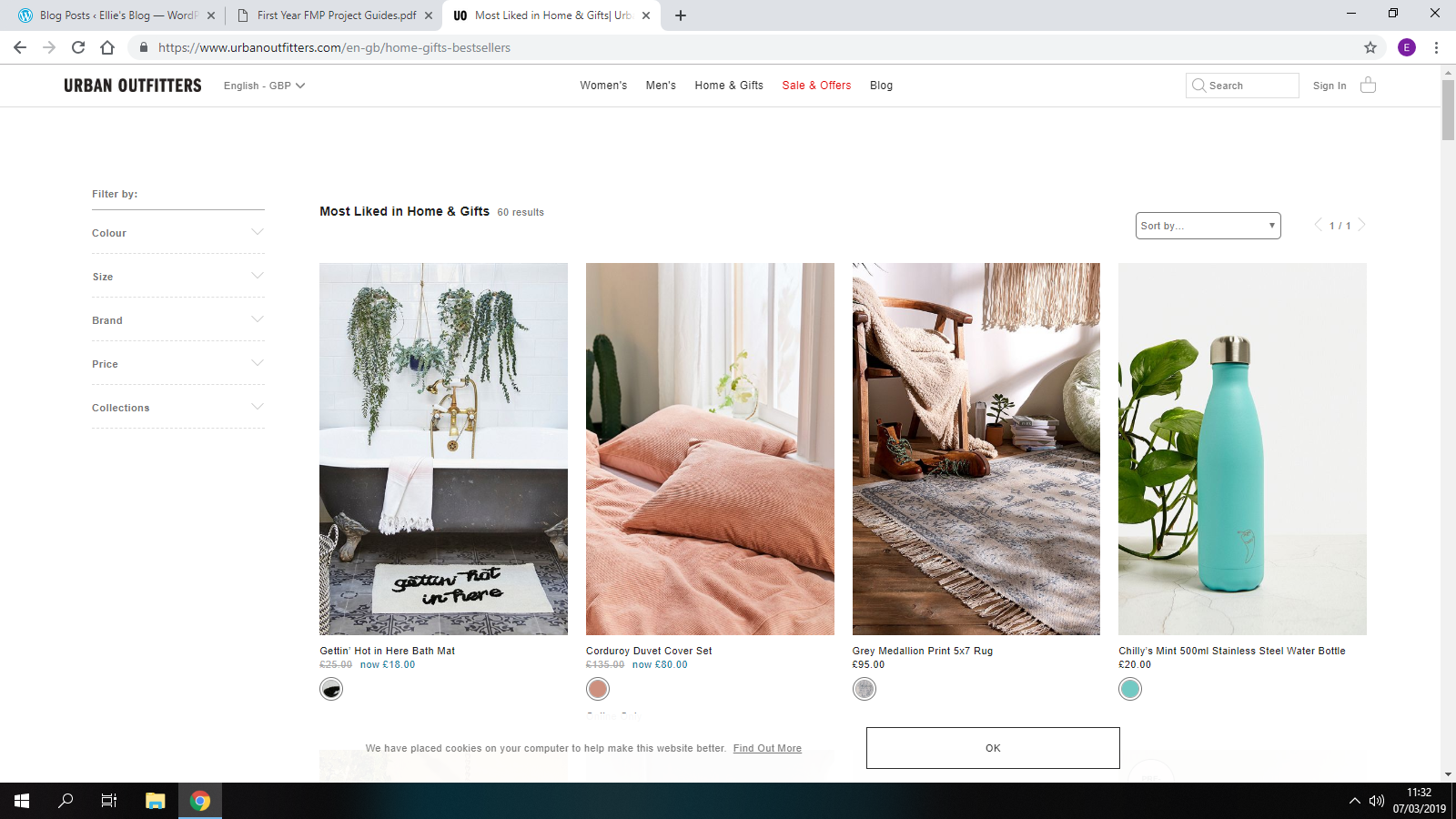
I started with looking into the urban outfitters original website.I will take inspiration from the headings used at the top of the website “women’s, Men’s, Home & gifts, sales and offers”.I feel as though most clothing websites have the same sort of headings for example-


From my research on headings i feel like the ones mostly used on clothing websites are the best ones to use as it gives the audience a easier and quicker way to find the things there looking for.

The layout of similar websites are all very alike.They all include a “sale” icon to catch the audiences eye and mostly all include a large photo of clothes they sell on the main page.
I like the way that urban outfitters has a ‘tumblr’ theme.The photos are very simple,they don’t have any dramatic affect or color scheme. The colors mostly used are white, grey and black and tend to use plants in the background.This is the type of theme i’m going for as i feel it matches with the types of clothing advertised with its quirky,vintage and aesthetic outfits and theme.

I then looked into existing adverts for similar clothing brands to mine.
This advert is promoting the champion brand that is sold in urban outfitters stores and online.This advert again gives off the retro/vintage vibe with the choice of background music.This was posted onto the ‘Urban Outfitters Television’ you tube channel.This has given me an idea of creating a You-tube channel and posting videos onto there as a way of advertising my clothing.On the urban outfitters channel they don’t only post adverts on,they also upload short stories,room refresh videos,review and tutorials and much more.This gathers more viewers which then results in more buyers.
You tube is a great way to advertise as it a much more easier and enjoyable way for viewers to watch the adverts rather than reading about the products.You tube is very popular and is mostly aimed at the younger generation which is great for my average target market age range. After doing some research I discovered that 6 out of 10 people prefer online video platforms to live TV.
I looked into some other clothing brand adverts-
This clothing brand is linked to urban outfitters.The style is slightly different and so is the target audience.I feel as though the name of the brand “free people” is shown is there adverts as the models come across as being free because there adventuring around alone.This also gives off the impression of being able to be yourself,wear the clothes you like and be free.As in you don’t have to be trapped in the society’s most popular clothing,that everybody wears.Telling you to be different and unique.
i did some research on existing clothing brand names to help get some inspiration for my own.I have decided to call my brand ‘Be Unique’.I have chosen this name because i feel as though the clothing sold will be unique to everyday outfits that everybody wears.Being unique and different to other people is a good thing and this is the message i would like to get across.You don’t need to follow the crowd with the typically outfit choice,be unique will be a different clothing brand and will make you stand out.
Next,i had a look a different clothing brand logos.The logo of a brand is what makes yours different and individual because every logo looks different from each other.Here are some i looked at-


I used a website called ‘Logo-joy’ to get some ideas on the type of logo i plan on making.I will change the design slightly to make it more personal but this helps give me inspiration and ideas for when i go onto affinity designer. These are a few i liked-


Roll over effect-
On some clothing websites this effect is used.It allows you to hover over the photo and then it changes to another.Usually one of a different view of the product for example shows you the back of it.
Editing Techniques-
Spot Healing- I found some tutorials on youtube to show me step by step how to do this on photoshop.
Removing eye bags-
Teeth whitening-
Font-
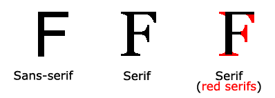
Serif
Serif typefaces are among some of the oldest modern typefaces. They are used in everything from book publishing to newspapers and magazines to billboards and websites.
The mood and feelings most associated with serif typefaces are classic, elegant, formal, confident and established.
Sans Serif
Sans serif typefaces are considered more modern and include a variety of widths and shapes. This style of typeface lacks strokes at the ends of letters (hence “sans” serif). The type category is thought to embody simplicity because of this lack of added detail. Sans serif typefaces have a look that is direct and precise, although character edges may be either sharp or rounded.
The mood and feelings most associated with sans serif typefaces are modern, friendly, direct, clean and minimal
Designshack.net. (2019). Serif vs. Sans Serif Fonts: Is One Really Better Than the Other?. [online] Available at: https://designshack.net/articles/typography/serif-vs-sans-serif-fonts-is-one-really-better-than-the-other/ [Accessed 21 Mar. 2019].
My advert will be the same style as this one.I will take inspiration from this because I will be taking similar shots.There will be people in groups and on their own walking,in slow motion showing close ups of the clothes.
YouTube. (2019). London Clothing Advert (HD). [online] Available at: https://www.youtube.com/watch?v=rxPlO3BOjs4 [Accessed 4 Apr. 2019].
