I used final cut pro to edit my advert.I saved all my clips onto a pendrive along with a un-copyright song I found online at https://www.bensound.com/ . I chose the song I used because I feel like it fitted best with my type of advert as it was happy, joyful and the sun was shining.
I cut the song a bit after the start as I wanted the song to play really quietly until she put her earphones in then the volume was louder.I put a few clips in slow motion such as the ones when Sophie spins and her hairs fly’s round in slow motion. I filmed at two different times with different people but I separated the clips to make it seem like they were all together. I tried to do as many different types on angles as possible to make it look more interesting and professional. At the end the music gets gradually quieter and the title ” Be Younique” appears on the screen.
I ended up going off plan when filming and did more shots than I thought I would. But in the end the advert ended up being 1 minute 26 seconds.Which is fine.
Similar products have made an impact as I used a lot of them for inspiration. I did research on similar online stores, Urban outfitters being the main one. I used this store to compare prices,themes, style ect.
My ideas have developed throughout the project, using research and similar products to extend my knowledge and make my website and advert the best I possibly can.
When checking my work and watching my advert I kept in mind my theory researched and made sure id used this in my work.The whole point of the AIDA theory is to grab the audiences attention and this was my overall aim.The acronym AIDA stands for Attention, Interest, Desire and Action. These are the four stages that a consumer goes through when watching or viewing an advertisement. This theory did make an impact as my audience feedback told me that the advert grabbed there attention and they wanted to “keep watching” or “carry on looking” through my online clothing website.
My audience gave me mostly positive feedback and only a few point of improvement which I will go over and try and put in if I have time. Overall the key words they gave me was “professional”, “aesthetically pleasing” and “interesting”. I made a questionnaire as an easier way to get overall audience feedback one for my website and advert.Here is what is got back.
questionnaire-
Only 54.5% said yes to this question. I will improve on my current advert by changing the background music. I will then add a mens advert and a mixed women’s and mens one. I will then ask this question again and see if the percentage goes up and try and get the 18.2% of no go down.
The results from this question were overall positive. Nobody said no.
Some people said they relate to my idea because of the overall style and theme I used. They said they wear them type of clothes themselves, therefore if the store was real they would possible take a look or buy from there. This shows my website and advert have been a success and has done the job it was meant to do.
I made a few changes when doing my practical that are different to my plans I made in the beginning. Firstly I changed location. I created a reece for Haigh Hall and in the end ended up filming in Worden Park. This is because there was a problem getting to the location and all the models getting there as the same time. I resolved this problem by changing the location to one near college therefore everyone could walk there easier. The location is very similar to the original one so didn’t have to make any other changes.
During the time of filming my advert I had to make a few changes. A few of the models changed so I made a new call sheet.
Problems I faced-
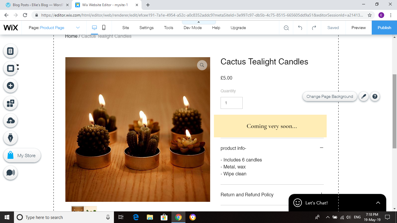
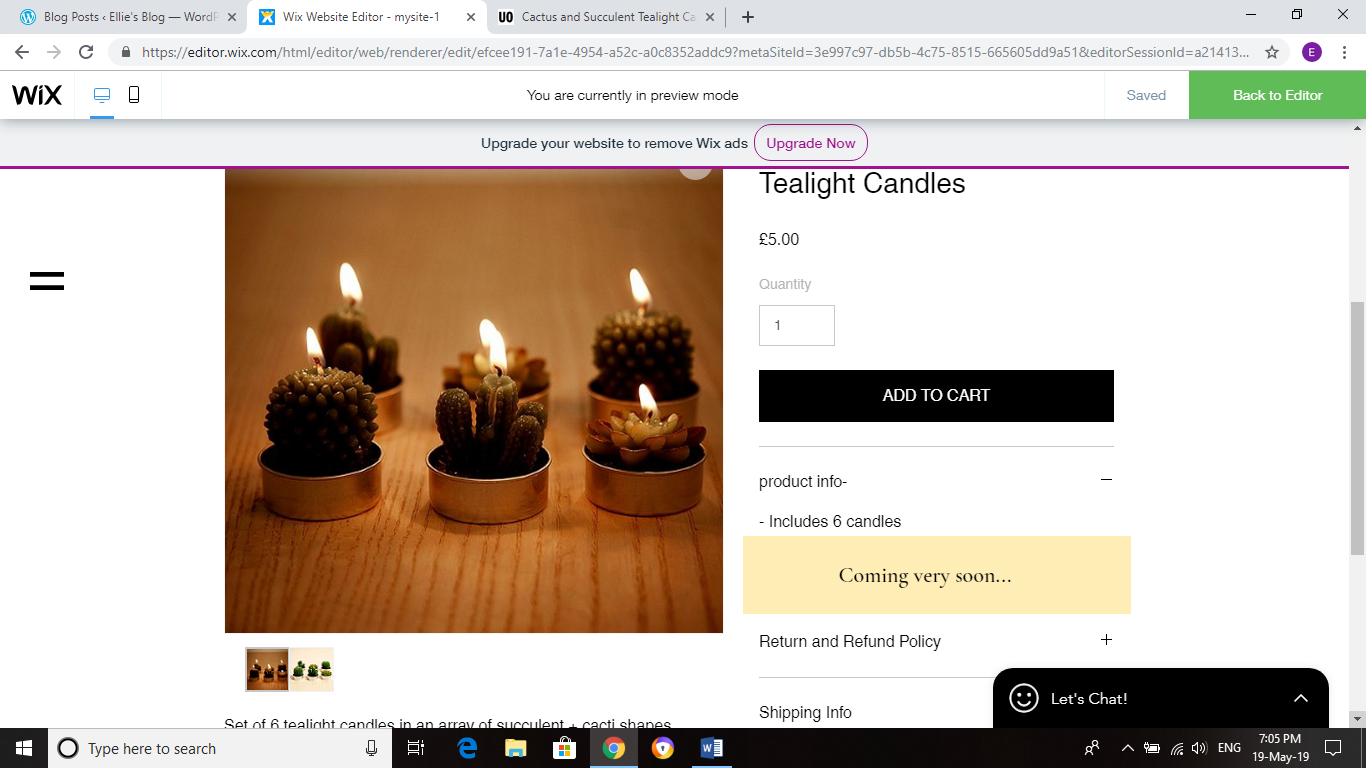
Because I used a layout on wix and just edited it myself i found it hard to make my website unable to actually buy the items.There was a link on every product that said “add to cart” which took you to another page to purchase the item. As I said on my website that the clothing was ‘coming soon..’ I had to somehow get rid of the link. I used a box to put over it like so-
I faced the problem that it kept moving on its own. I couldn’t do anything to fix this. I had to get rid of the over box I made and just deal with the viewer not being able to buy the product.
Another problem I faced is getting all my models to the location at the same time for filming. To fix this issue I changed the location to one closer to college to everyone could be there during college time and wordon park is only a 5 minute walk.
Research–
The results from my primary research are shown clearly in my finished work.You can see that the feedback from my questionnaires and tally charts have been used as inspiration and have helped me make decisions on certain things. An example-
You can see this primary researched helped me as I ended up using the photo the target audience chose.
On one of the questionnaire questions I asked “If you could change or add anything to the advert what would it be? “
I got more than one comments about having a mens clothing section but not a mens advert.
I would have defiantly considered this if I had time. For now the mens advert will be “coming soon..” just like more pieces of clothing.
Secondary research –
My secondary research was very useful and made an impact on my work. I used the research I did on Theory and Historical Info, Official Information, Copyright free materials ect. The copyright free researched helped as I then knew I had to find some copy right free music on my advert. I also researched and looked into similar online stores as shown in the previous blogs. This gave me ideas for my own and inspired me to improve mine and make it look as professional as possible.
Without this research I wouldn’t have known where to start or even have a layout for my website. I made my photos look like ones of real websites so it was realistic and professional. I did the most research on Urban Outfitters.
For my home section I picked out what products I would like to sell and found them online. I picked the best and more appropriate photos and used them on my website.
I made a link from the homepage to the home section.
I changed the background to plants, which I found on Google.
I understand that if my website was a real online store i wouldn’t be able to use photos of products from other websites.Here are the references of all the photos i used-
Because I am running out of time, I have decided to do less products on the mens section than i did on the women’s. I have added to the mens page at the bottom “More products coming soon”.
For one of the T-shirt’s I managed to get 2 different colours so i added these into the same item but made the other colour a suggestion.
Overall I managed to complete 9 products for the mens section and 15 for the women’s. I used the same editing techniques on almost all the photo’s.
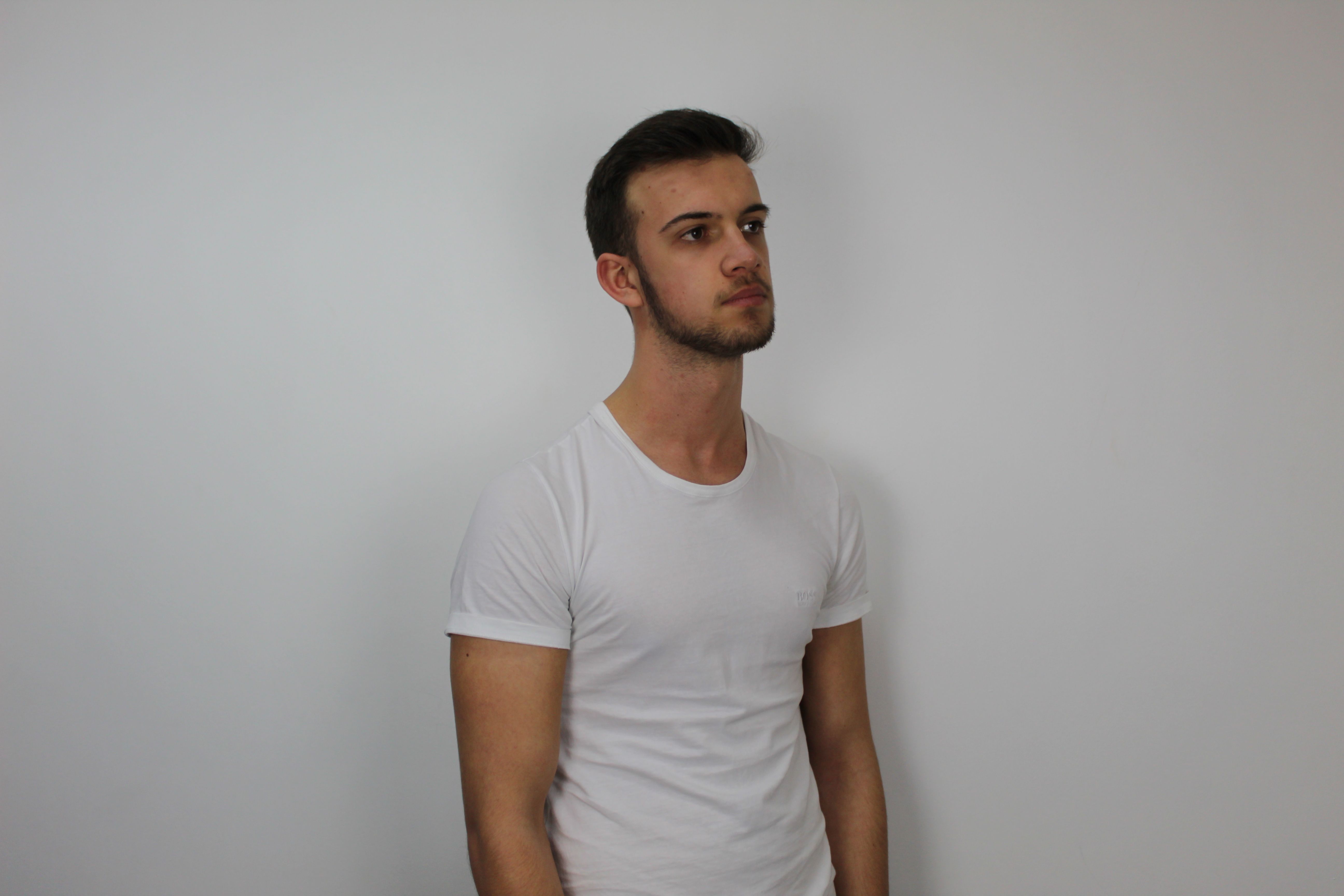
Because the T-shirt is white I found it hard to separate him from the background.I used the lasso tool and zoomed in closer in order to make it accurate.I cut out the parts that the quick selection tool couldn’t do.This then made it easier to use that tool.
j
I then went over parts that were missed out-
I used the rubber tool to do this I made the ‘hardness’ low for it to not look as sharp or un-realistic.
I decided to change the prices that were already on the website for this one.I think ‘£29.99’ is above the average price for an item like this.I want my clothing items to be affordable,especially when my target audience age range starts so young, teenagers may not be able to afford really expensive things especially if there still in education.
I looked into other clothing brands including urban outfitters which is the one i’m taking inspiration from to compare prices.This is what I found-
£26.00 is around the average price for the t-shirts at urban outfitters.I will change mine to £22.00,so its similar to other brands like mine yet more affordable.
I made some items ‘on sale’ to show the audience that we do good deals and they can find things cheaper. It also makes people want to purchase the clothing more if it used to cost more as they will be saving money (£14) . Overall it makes the store/website seem more real and genuine.
I used the same techniques shown in the previous blog for most of my photos so here are some before and after editing shots for the rest of the photos i edited on photo shop-
Before I did anything else on my website i started editing my photos using photoshop.
Before edit-
I used the quick selection tool to cut round Sophie.I then created a new page with a white background and moved the cut out over.I used a smaller white brush to go round the edge of the hair and bits that didn’t cut accurately.I then adjusted the ‘Camera Raw filter’ by going onto ‘Filter’.
(I went round the edges of the hair with the paint tool and coloured in white)
Because I made the background fully white I had to change the exposure quite a lot in order to make Sophie look as bright as the background so it would look more realistic.I also changed the ‘Blacks’ to bring out more detail.
Before ^ and after-
I then brightened her eyes.I cut round her eye using the lasso tool and moved into onto a new page.I then adjusted the brightness of the eye and moved it back and placed it over her eye.
This is the difference-
I then uploaded the final photo onto my website homepage.
I put this effect on it as i thought it look Unique and thats the style i’m going for (in the name) as not many clothing websites do anything like this and it makes mine stand out from the other ordinary websites.
For the second picture I did the same technique to get the white background.
I have to use the lasso tool to draw out this gap in his arm then cut out the background in order to make it white like the rest.
For his skin I used the eye dropper tool to get the exact skin colour them painted over the spots and marks on his face.I make the ‘hardness’ really low so it wouldn’t be too noticeable. Here is before and after-
I put the same effect on this photo as well as Sophie because these are both going on my homepage next to each other like so-
For my ‘women’s’ section I used the same Picture as on the homepage of Sophie (without the effect).When you hover over the picture it shows a back view of the t-shirt.To edit this photo I cut Sophie out from the background and moved her over to a new page with a fully white background.I used the rubber tool to go over her hair and other parts that didn’t cut out accurately.This will make it look more professional and realistic.
I didn’t have to do much editing on this photo as its only showing the back of the t-shirt and that is all.
For this next picture I cut her out using the same technique.I then used the brightness and contrast tool to brighten her up a bit so she would match how bright the background now is.
Before and after-
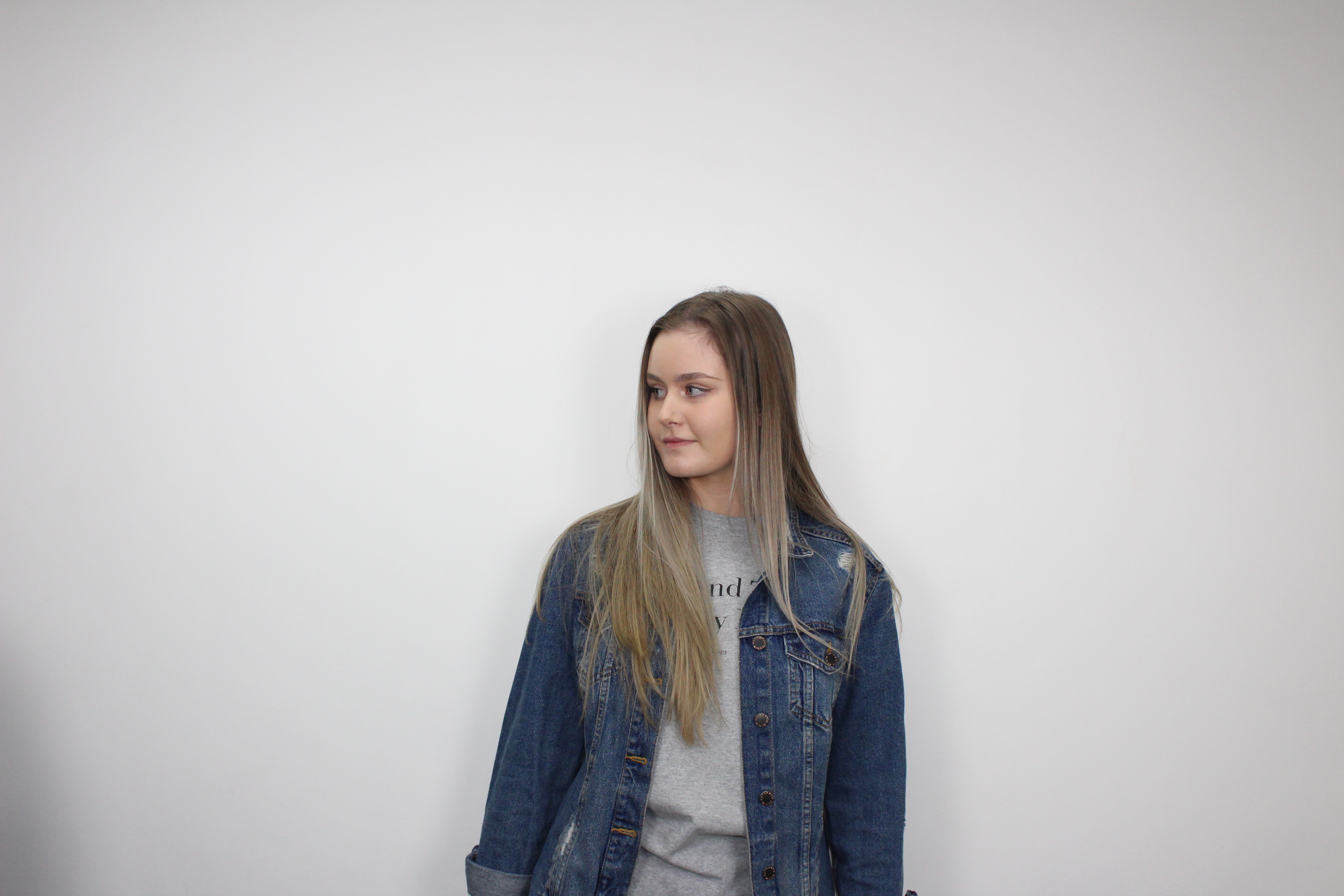
For this photo i found it hard to cut Megan out from the background because the coat is white.I used the Lasso tool to draw round the coat and make the background a brighter colour that the coat will stand out from.
It was then easier to use the quick selection tool. I then used the same technique and dragged the cut photo onto a new bright white background.
I adjusted the brightness and contrast of the photo in order for it to look more realistic. Some parts of her skin didn’t change much for example-
So decided to use the lasso tool to draw out the bit i want to change,I then filled it in using the paint bucket tool like so and just filled in the gap black.
I used the eye dropper tool to pick up a brighter colour from her teeth to them paint over the darker parts in order to whiten them in general. This is before and after-
For this photo the sleeve on the t-shirt was sticking out, to fix this is used the rubber tool and changed the hardness on it to it looked realistic-
I have chosen to create my website on wix. I have chosen wix because i feel as though its really easy to use.There are options on the site such as a help center to find the answers to your questions.There are 500+ templates to choose from to help you start off your website.You can also hire an expert.I have used wix in the past to make websites before so having some experience helps when coming to using the website,even though it is straightforward.
I typed in the name of my brand and wix suggested some templates,this is the one I chose. I liked this template because I feel as though it matches best with my theme,its plain and simple which is what my audience prefer (i know this because of my questionnaire primary research). The logo is yet to be made so it will look slightly different to this when its finished.
I also investigated the other option, wix then suggested some themes and templates,I liked this one.They are both plain and simple which is what i was looking for but they are slightly different.The first one is one long page you can scroll down and explore more things on the website.It includes more images and can add a ‘about us’ section.The second in the same but they layout is different and is very colourful.
I made a tally chart to ask my target audience which they prefer.
Here are my results-
A) |||||| 6
B) ||||||||||||||||||| 19
Out of 25 people 6 said A (24%) and 19 said B (76%).
I added this onto to top of my website as it is relevant to my audiences age range.
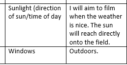
For the strip background I chose this plant image as it matches my theme perfectly.Urban outfitters use plants a lot in there backgrounds of photos,the green is eye catching and brings out all the other colours.Plants them selves are calm and peaceful,like the style.
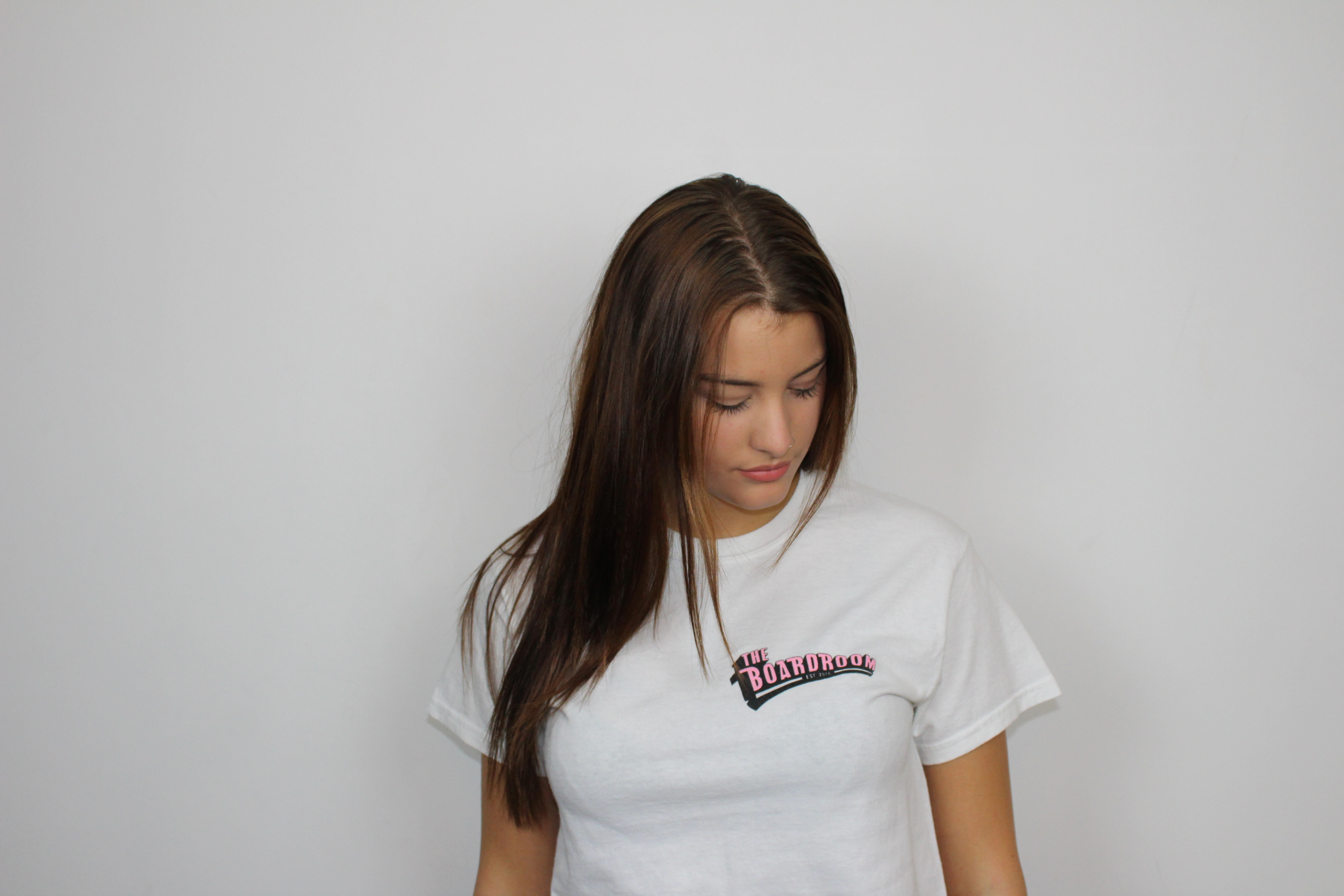
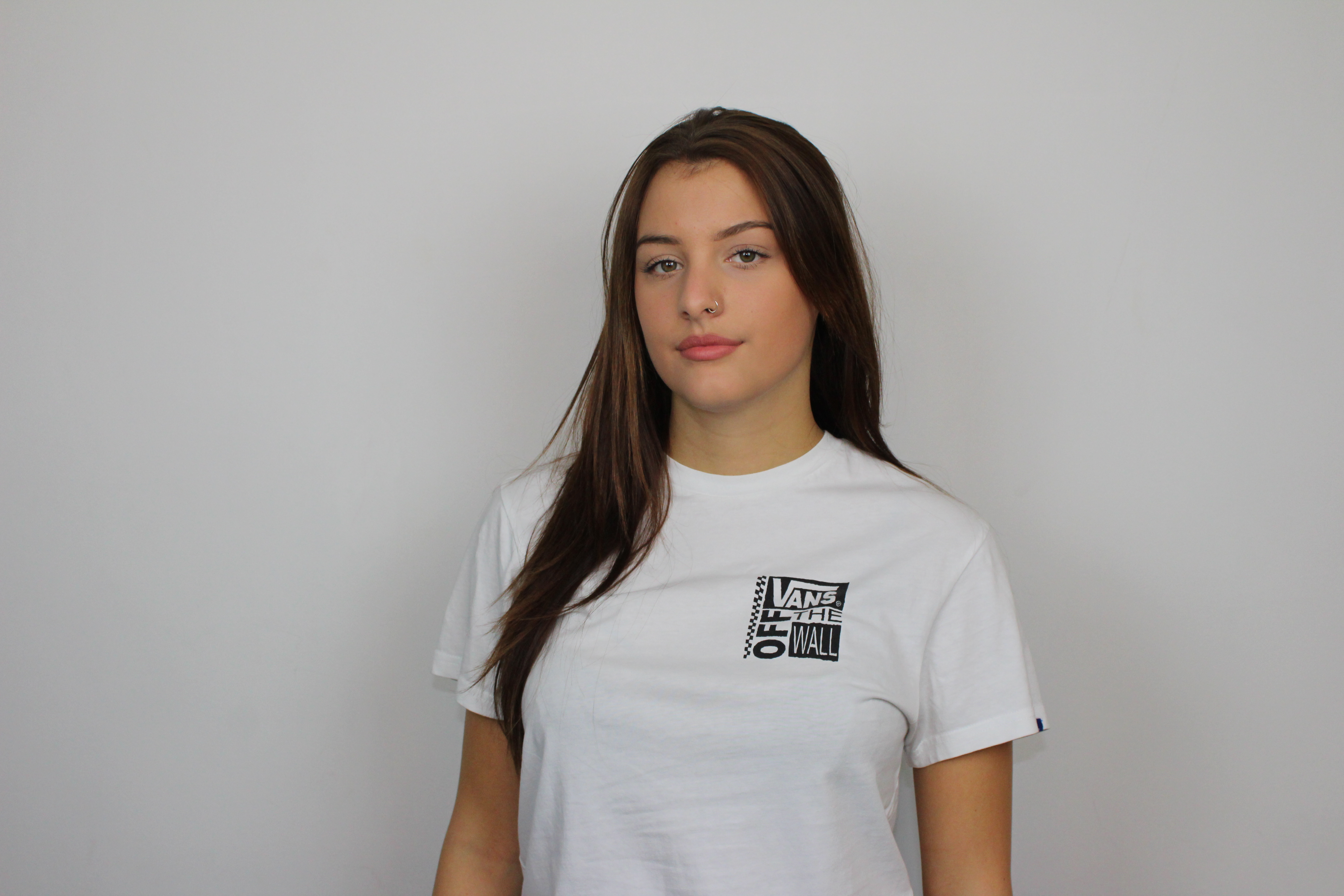
I took a large amount of shots so i could choose the best quality ones and which look best. I asked the models to stand in different positions and poses. I have taken at leased a minimum of 200 photos for the women’s and men’s section.
When i had fully edited both my pictures for the home page I uploaded them.
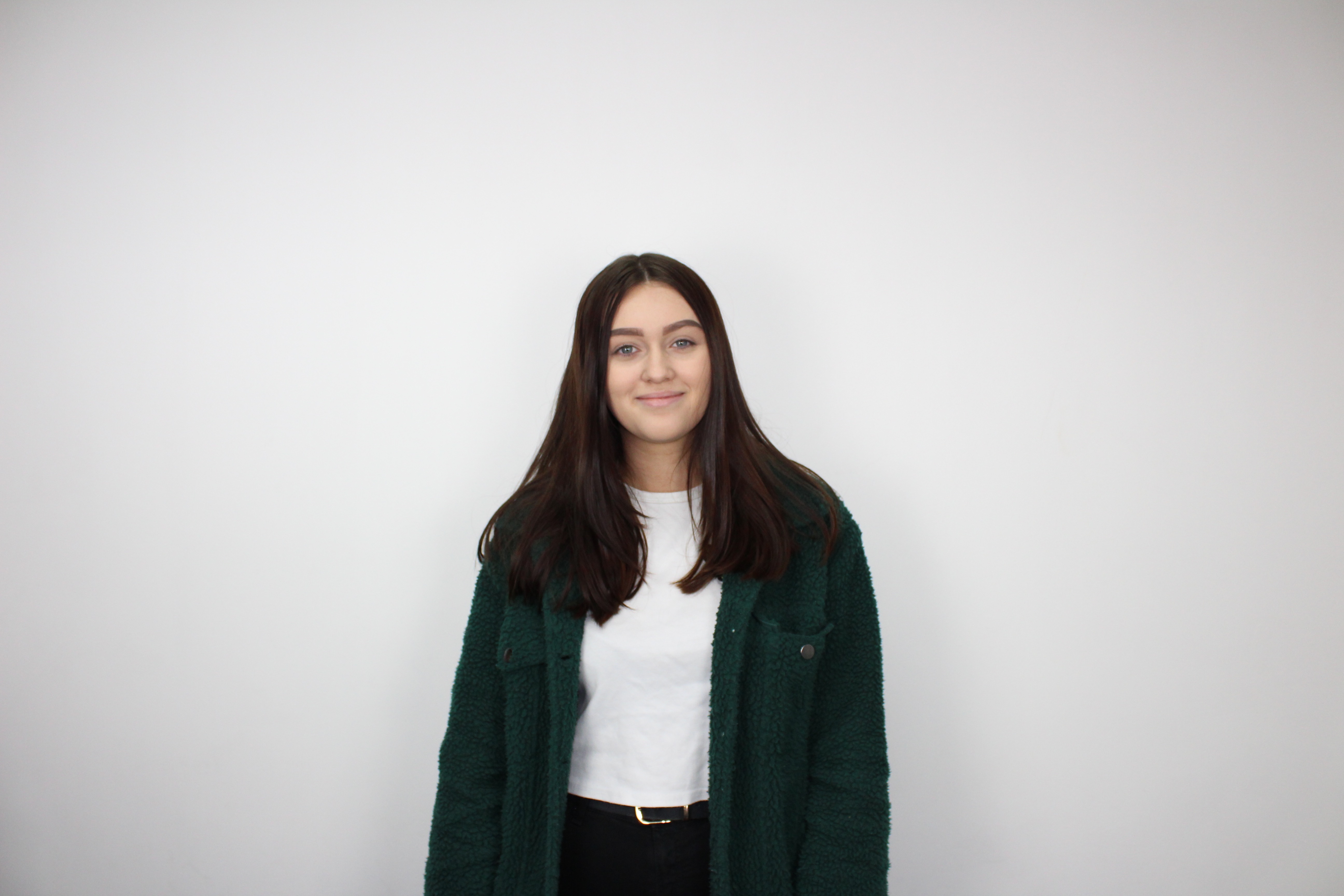
I them moved onto the “women ” section of the website.I started off with uploaded the same picture on the homepage,this is because this t-shirt will still be available to buy and the first picture isn’t very clear with the effect on it.
When you hover over the picture it shows you another picture with the back view of the t-shirt.
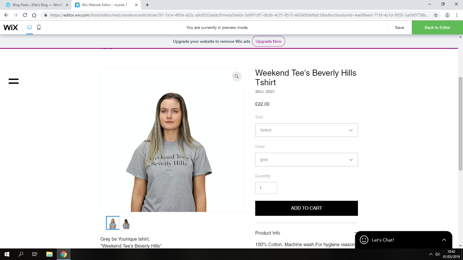
When you click on the image it gives you the option to buy to t-shirt and select a color and size. I kept the sizes as ‘XS,S,M,L,XL’ so that there’s a large range of different sizes available for everybody.I had to edit the color section to grey only.For some items i will edit them different colors but this one is only going to be available in grey.
I had to add ‘Product info, return and refund policy and shipping info’.This is what i wrote-
Product Info-
100% Cotton. Machine wash
Return and Refund Policy
We promise to refund any unworn, unused item you are not completely happy with when you return it to us in saleable condition by post (or Hermes ParcelShop within the UK) within 14 days of receipt, or to your nearest store in the UK (excluding department stores) within 1 month of receipt.Refunds will be credited to your original method of payment.For hygiene reasons we do not offer refunds on pierced jewellery, underwear, swimwear if the hygiene strip has been removed, or cosmetic products if they have been used or the hygiene seal is broken, unless they are of unsatisfactory quality or unfit for purpose.
Shipping Info
Standard delivery – Up to 5 working days – Free to orders over £50,if under the additional cost is only £4!
I got inspiration from other websites to come up with these.I will copy and paste them only every items information.
PROBLEM-
My items aren’t actually available to buy,therefore I had to get rid of the ‘add to cart’ button on the clothing pages.The template was one big one so I couldn’t just delete that section. To fix the problem I had to insert a shape and place it over the button so that the viewer can no longer click on it.I changed the colour so it would look better and used the text tool to write ‘Coming very soon…’ over the top like so-
I did this on every item.
For this T-shirt there is a blue and a pink one available.To show this on the website a changed the info and posted both the tops under the same item.
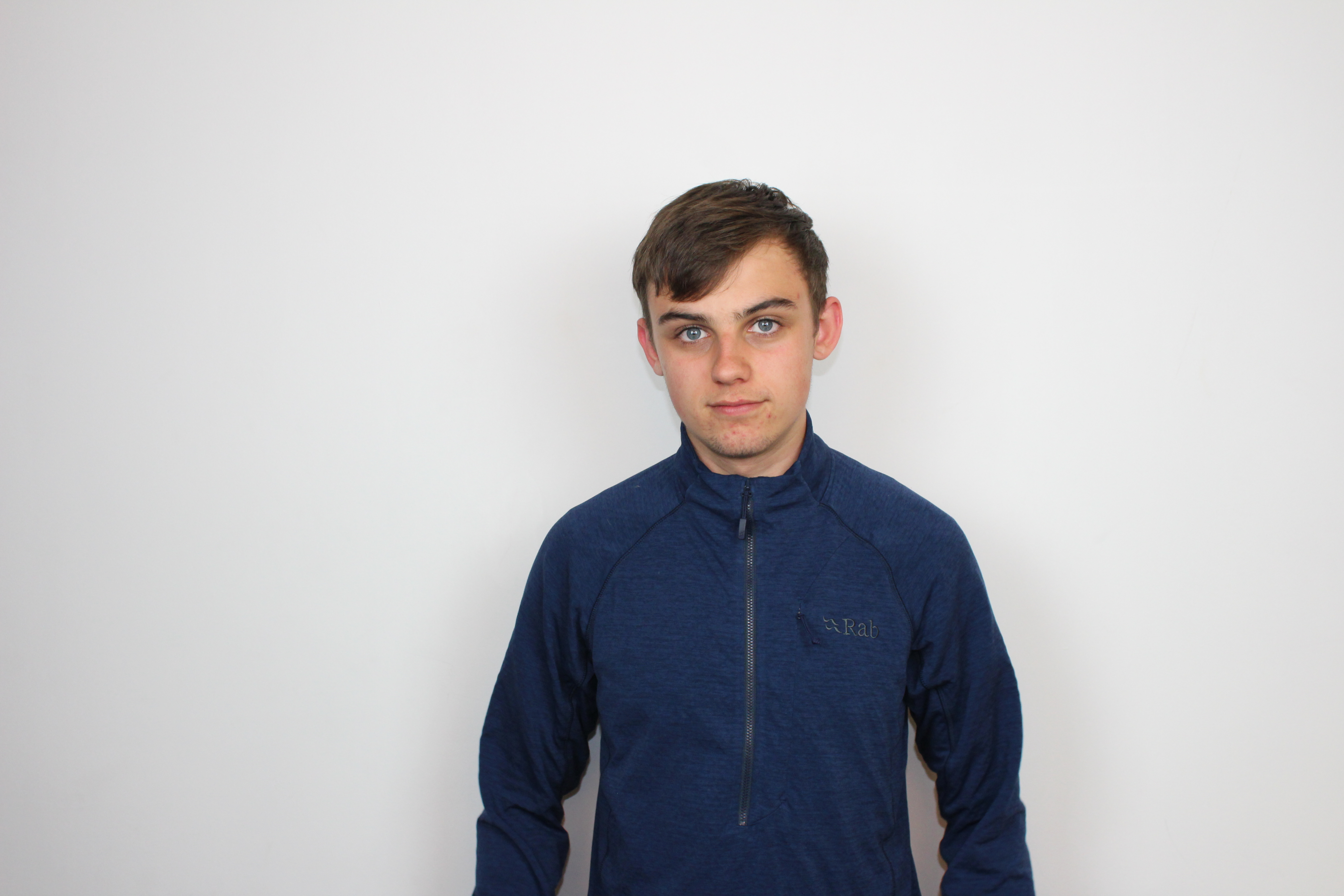
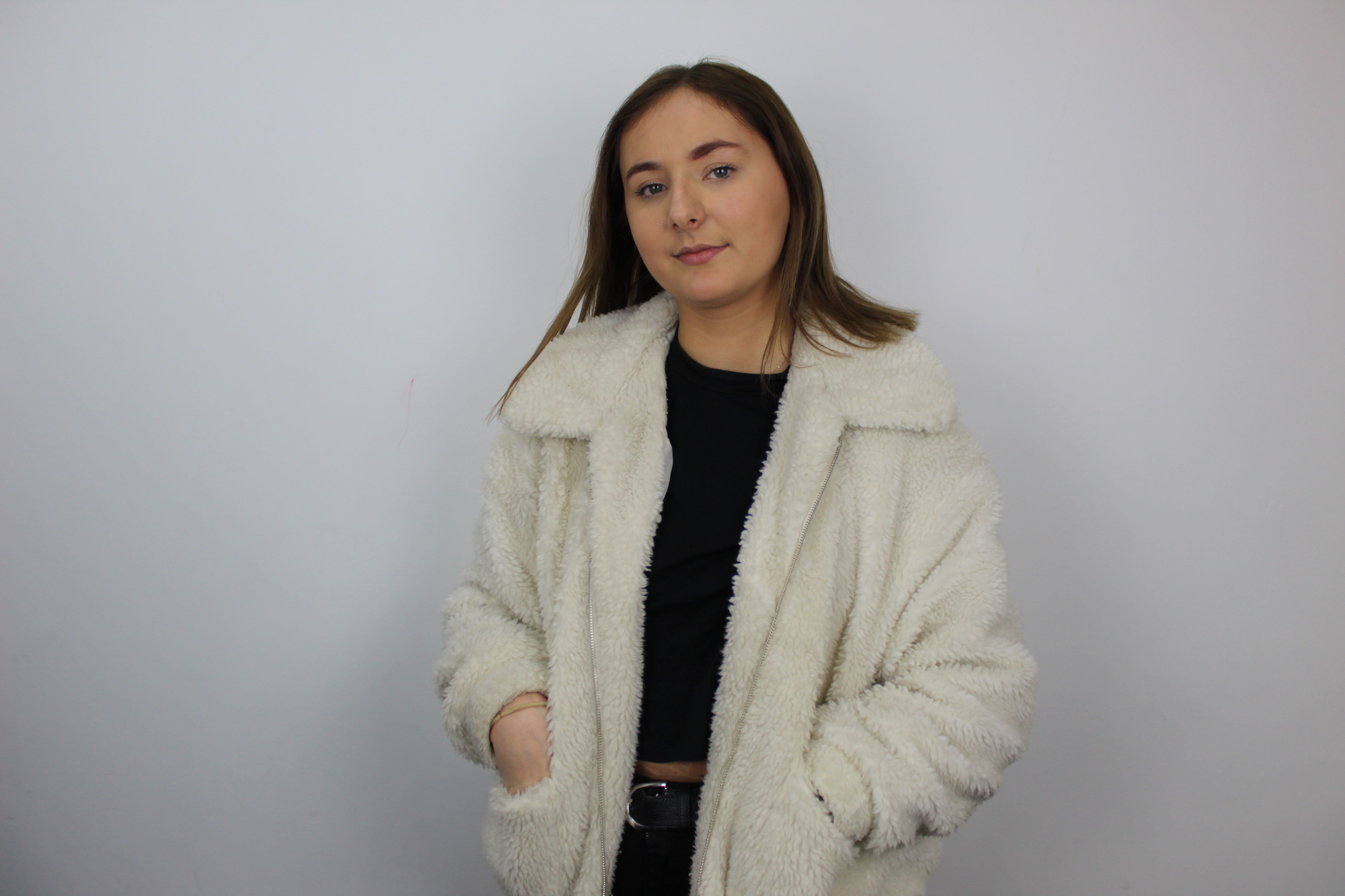
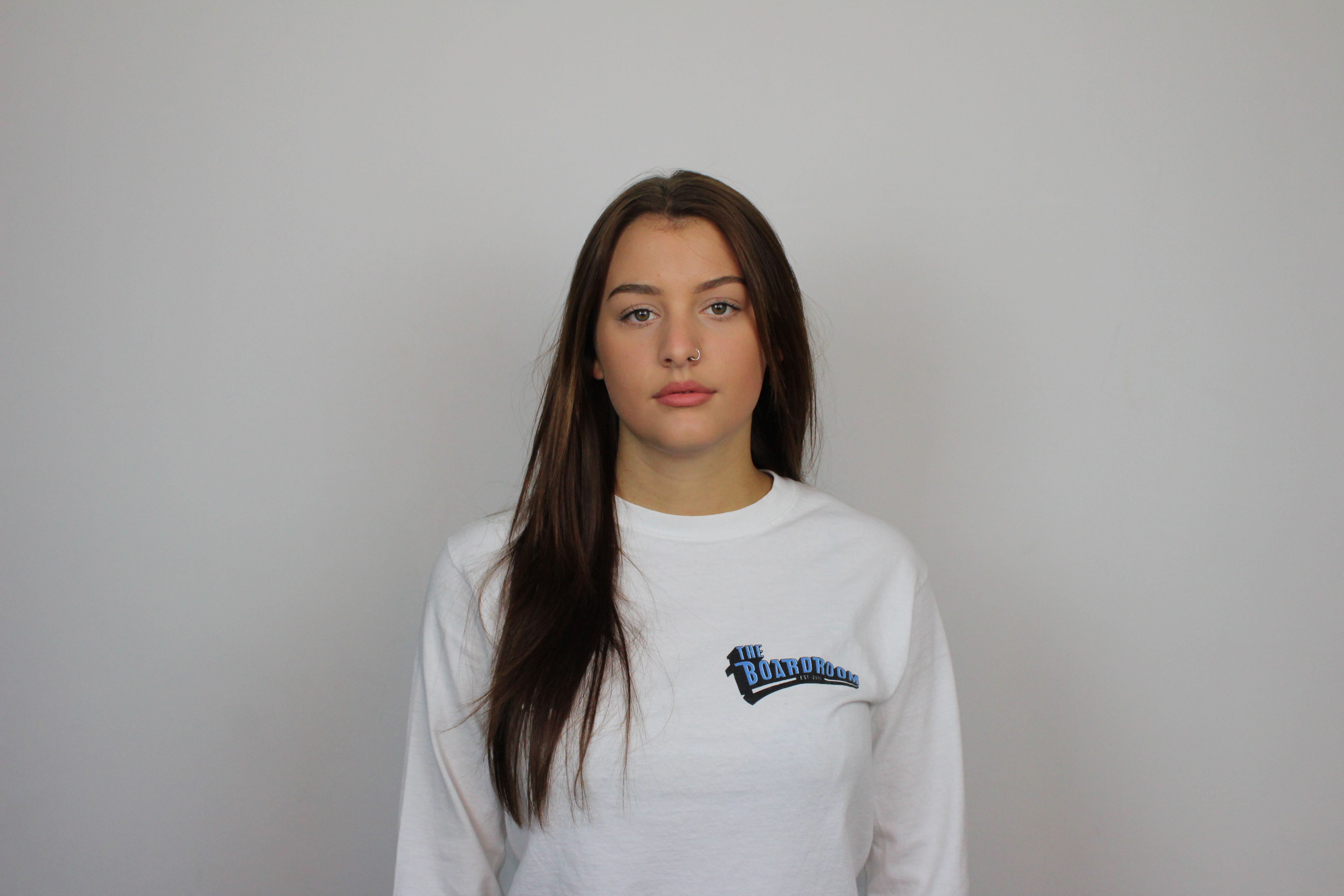
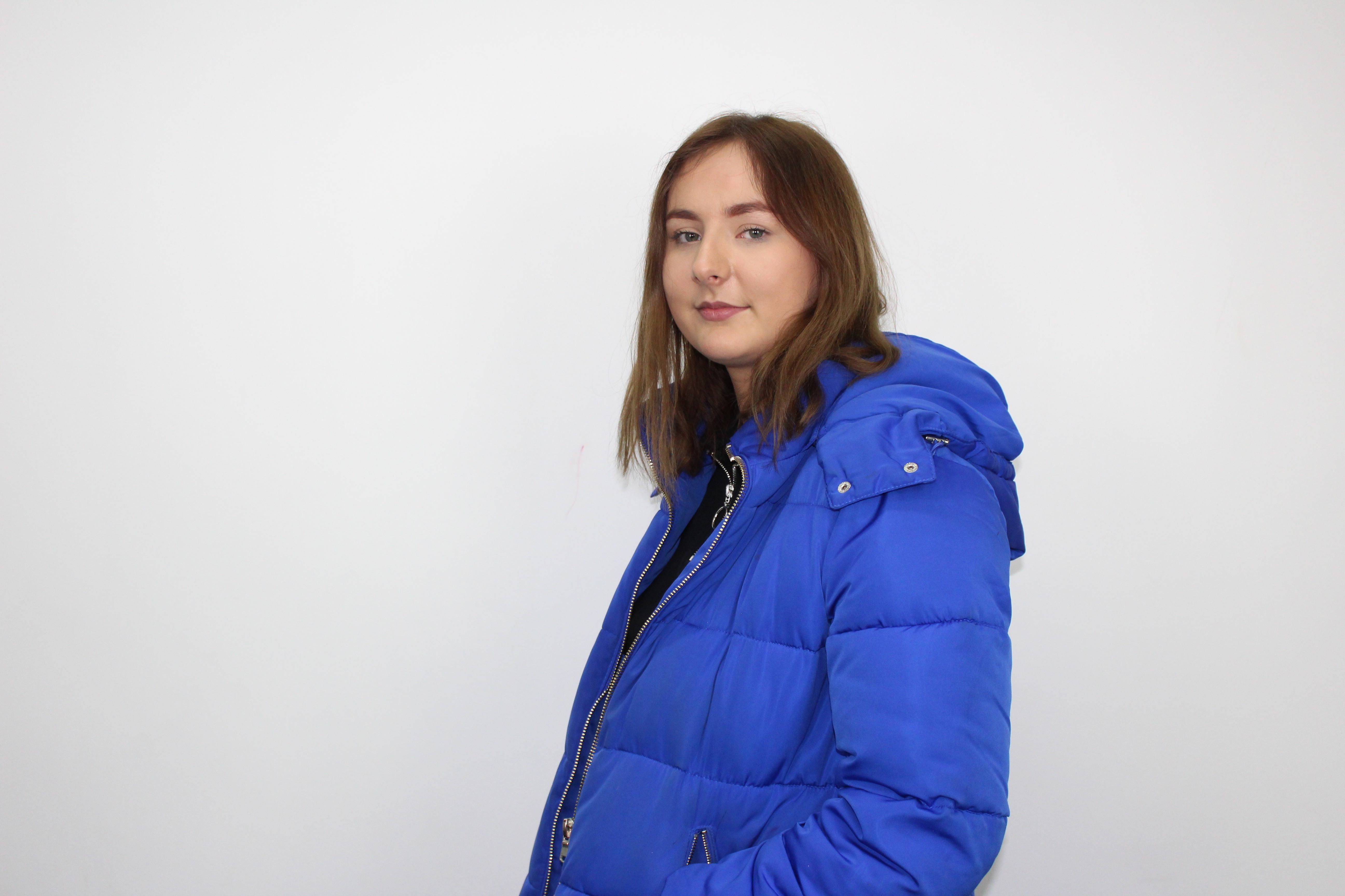
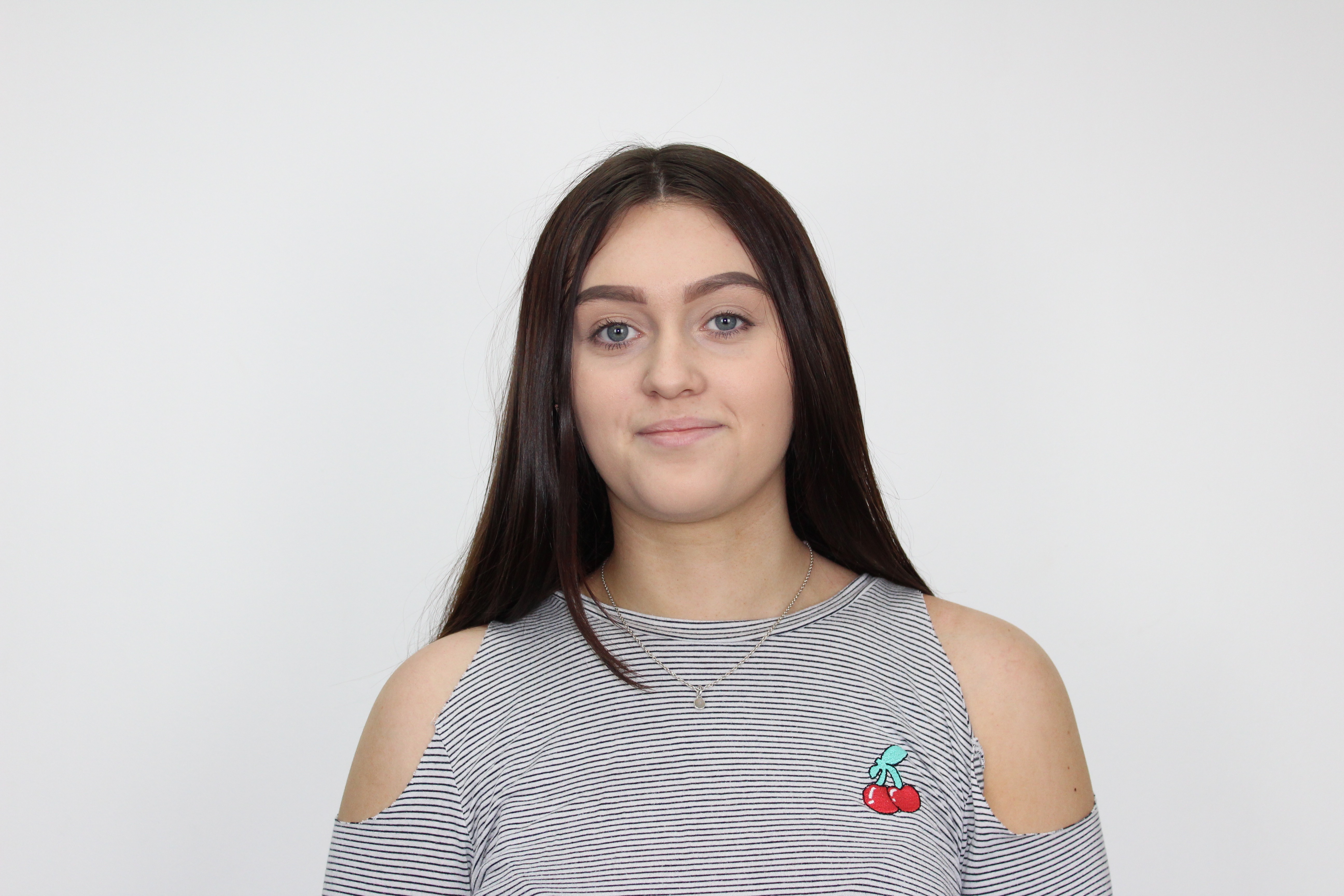
Ive made a small questionnaire to get some audience feed back.I asked my target audience which photo they think would look the best as the front main photo out the two.The photo which the audience see first which has to make a first impression to determine if the item gets picked or not. These are the photos-
1-
2-
1 ||||||||| 9
2 |||||||||||||||| 16
These results show that the audience prefer the second smiling picture to the first more serious one.I will use this are the main imagine but still use the other.
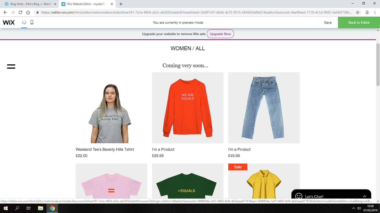
The women’s page is finished with a total of 15 items and one with two separate colours. I will try and do the same amount of mens clothing on the other page so it looks fair and even.
So far i am happy with my photos and how there edited. I don’t think i will need to make any changes other than add more if i have enough time.
These both link to the other pages. I added a nice plant background in that I found on Google.
Lastly, i’ve added my finished advert onto my website through a youtube link. I made a new page to upload these onto to-
My aim is to now make a separate advert for the mens wear then a third one with both men and women’s combined.
I have added some social media stickers-
I haven’t had time to make an Instagram or any other accounts for my brand.I added this anyway just to show what the website should include.A clothing brand like this would normal have an instagram or Facebook to upload more photographs ect.